Masks, gradients and SMIL animations on an SVG
Table of contents
In other articles we talked about how to animate web elements, in fact, we highlighted that there are several ways and tools availables that we should getting to know before we start working on an animation. Each one of those approaches have theirs pros and cons, that is the reason why we insist on we need to know them deeply in order to optimize our efforts. So, if we want to animate an SVG, one of those ways we could take is doing it with SMIL.
NOTE: The future of SMIL is far from being clear. It has a wide support but it could loss strength if the browsers reject it and bet for pure CSS animations and the newest Web Animations API
SMIL stands for Synchronized Multimedia Integration Language, and it is a group of tags and attributes that let us animate, transitionate or interpolate the values of the attributes of the tags only adding them to our regular <svg>. The specification is quite vast and it does not worth listing all the properties and possible values at this point but we can highly recommend read the article of Sara Soueidan for CSS-TRICKS. We are going to inspect this demo to clarify how it works and we are going to explain how to apply masks and gradients within a <svg> as well.
Start
We are going to create a <svg> that holds a text so we could use the <text> and <tspan> tags, also a <defs> tag in which we are going to define our gradients and masks (<linearGradient> and <mask>). In our case we are going to use two text elements, two gradients and a mask made of a hundred circles of different sizes, so for the shake of simplicity when writing the code we are going to use PUGJS so we could use JavaSccript and use loops and aritmethic functions.
How to create gradients and masks
We are going to create two linear gradients using two colors (start and end) and then assign to them and unique ID that will let us identify, call and apply them over the elements that we want to, so for our demo they are the <text> elements and we are going to use the [fill] attribute.
<defs>
  <linearGradient id="gradientMamut" gradientTransform="rotate(0)">
    <stop offset="0.5" stop-color="#ff0066"></stop>
    <stop offset="0.95" stop-color="#17e2c6"></stop>
  </linearGradient>
</defs>

<text x="40" y="75" fill="url(#gradientMamut)">
We create the mask inside the same definition tag and we assign to it another ID so then we could use it over another elements as we did it before.
<defs>
  ...
  <mask id="ballons"></mask>
</defs>

<text x="40" y="75" fill="url(#gradientMamut)" mask="url(#ballons)">
Using a while loop we create the circles that fill the mask and we dynamize them using some utility functions to obtain random values so finally our circles are not going to look the same, it will feel more natural since the values of the attributes are going to be different each time the demo runs. Thus, the result will be different each time but similar in its core.
  var getRandom = (factor, addition = 0) => {
    return Math.floor(Math.random() * factor + addition)
  }
  var getAlpha = (factor) => {
    return Number((Math.random() * factor) / 100).toPrecision(1)
  }

  while i < 100
    - var positionX = getRandom(130)
    - var positionY = getRandom(10, 90)
    - var radius = getRandom(13, 1)
    - var duration = getRandom(5, (20 - radius))
    - var red = getRandom(255)
    - var green = getRandom(255)
    - var blue = getRandom(255)
    - var alpha = getAlpha(90)

    circle(fill="rgba("+red+", "+green+", "+blue+", "+alpha+")" cx=positionX cy=positionY r=radius)
<defs>
  ...
  <mask id="ballons">
    <circle fill="rgba(64, 123, 91, 0.6)" cx="124" cy="91" r="6"></circle>
    <circle fill="rgba(190, 99, 182, 0.7)" cx="44" cy="98" r="6"></circle>
    <circle fill="rgba(61, 250, 71, 0.7)" cx="46" cy="95" r="12"></circle>
    <circle fill="rgba(63, 100, 183, 0.05)" cx="53" cy="95" r="11"></circle>
    <circle fill="rgba(52, 189, 254, 0.2)" cx="47" cy="99" r="7"></circle>
  </mask>
</defs>

<text x="40" y="75" fill="url(#gradientMamut)" mask="url(#ballons)">
Sequencing the animation
The animation will consist on several steps:
- Showing the element on the viewport
- Showing each text element
- Modify the gradient’s colors stop points
- Animate the position along the veritcal axis of each circle
Animating with CSS
We are going to create a simple CSS animation in order to show up the element on the screen that will get fired after the document loads and that animation will update the opacity and the position of the element to make it smoothly visible.
@keyframes show {
  0% {
    opacity: 0;
    transform: translate(0, 2rem);
  }
  100% {
    opacity: 1;
    transform: none;
  }
}
Animating with SMIL
We are going to use the tag <animate> to animate our <svg> tag. We could use some attributes that control the animation, such as:
[attributeName]- Indicates which attribute is going to be modified[values]- The values -comma-separated- that is going to use[dur]- The duration of the animation[repeatCount]- The times the animation is going to be repeated[begin]- At what time the animation starts[calcMode]- Indicates the way the animation is going to be interpolated
So we are going to animate the text elements
<text x="40" y="75" mask="url(#ballons)" fill="url(#gradientMamut)">
  <tspan dx="-5">yo</tspan>
  <animate attributeName="opacity" values="0;1" dur="700ms" repeatCount="1" calcMode="paced"></animate>
  <animate attributeName="y" values="80;75" dur="750ms" repeatCount="1" calcMode="paced"></animate>
</text>
The stop color points of each gradient
<linearGradient id="gradientMamut" gradientTransform="rotate(0)">
  <stop offset="0.5" stop-color="#ff0066">
    <animate attributeName="offset" values="0.5;0.1;0.5" repeatCount="indefinite" dur="10s" calcMode="paced"></animate>
  </stop>
  <stop offset="0.95" stop-color="#17e2c6">
    <animate attributeName="offset" values="0.95;0.99;0.95" repeatCount="indefinite" dur="10s" calcMode="paced"></animate>
  </stop>
</linearGradient>
And every circle within the mask, its final position on its Y axis with a random generated value, its duration (random aswell) and its starting point which is going to be increasing.
<circle fill="rgba(78, 196, 61, 0.7)" cx="1" cy="90" r="11">
  <animate attributeName="cy" attributeType="XML" values="0;92" dur="10s" repeatCount="indefinite" begin="0.42000000000000004s" calcMode="paced"></animate>
</circle>
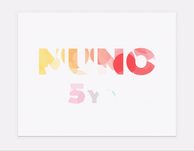
With all the settings we have done before, we have created a happy and colorful animated card just with a single HTML tag, a bit of CSS and nothing of JavaScript.
Conclusion
At the same time that we were using complex techniques not very frequently these days to animate a mask applied to a SVG, we have just discover the strength of SMIL. It is obvious but if we never try new approaches we never are going to discover them, so we just need to, from time to time, put the focus on try new things. It is not easy to find the time and the energy to start this tasks but we probably find at the end of the way a happy surprise.
To know more
- Specification SMIL
- SVG SMIL animations
- <animate> at MDN
If you find it interesting
If you have any doubt or you want to chat about this topic, as if you find interesting the content or our profiles and you think we could build something together, do not hesitate to contact us trough the email address hola@mamutlove.com